-MOBILE APP REDESIGN-
GROCERY SHOPPING APP FOR SENIOR USERS
Project Description
This is a final project for the class ‘UX design’ I took in my junior year, and this is an individual project. I redesigned the Chinese grocery shopping app for senior users so that they can access to this service more easily.
Clearly identified target group
Shopping journey map re-design
UI improvement
Menu language rephrase
Problem Statement
The main problem that the elderly people in China face is the difficulties of using digital technologies which leads to them being inaccessible to use some services. Their best option is to go to the places in person or find in-person customer service. But of course, they couldn’t always access it. With the pandemic causing them to have to quarantine at home, they can not even buy groceries which causes the problem only gets worse over time.
Research
Some APPs made a ‘senior version’, but there has not been a senior version for the grocery shopping app.
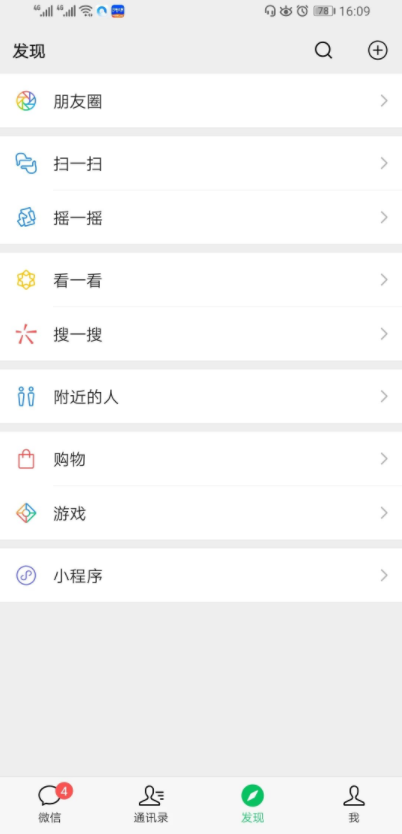
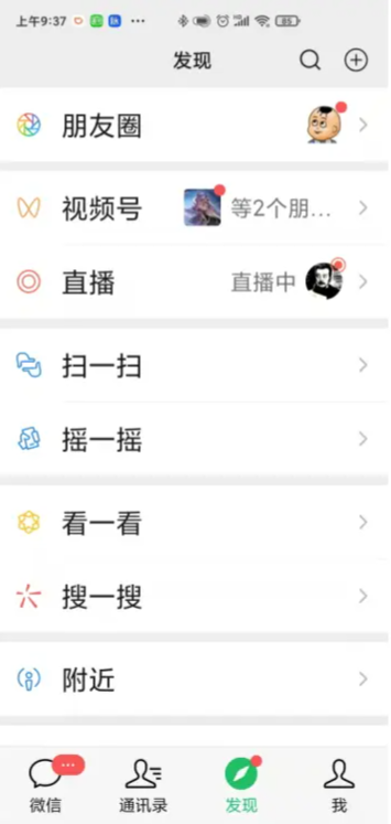
And many of those so-called ‘senior version’ just make the font bigger but all functions are still the same, which is not really helpful. (e.g. the Alipay senior version & wechat senior version comparison)
The Chinese government vigorously advocate and support the design of products & service for senior people, based on several governmental documents. So this is a good initiative and will be easy to get resource support and promotions.
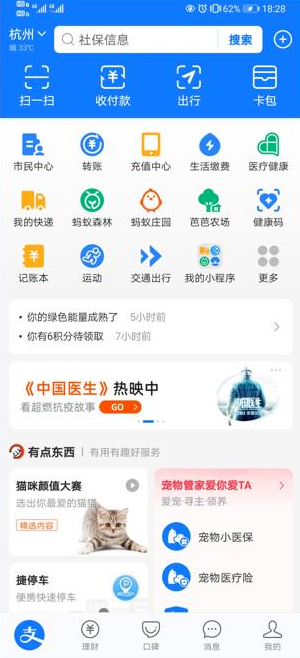
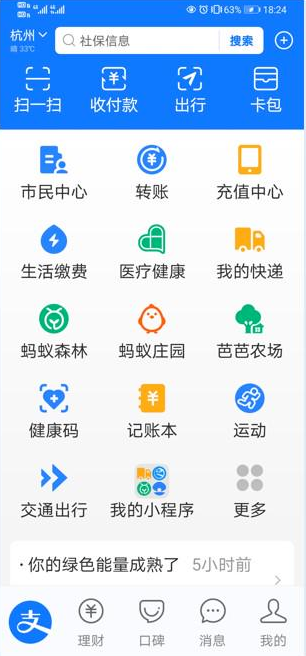
Alipay senior version before & after comparison
Wechat senior version before & after comparison
Possible Solutions:
-
This is the quickest way to do so, but it might still be annoying to go through all the steps.
-
Not all senior people have children who are willing to help them, and they might not want yo spend their children’s money.
-
As senior people might have a hard time looking at the small phone screen and type, it might be easier for them to communicate by voice.
However, there are too many accents in China which makes it almost impossible for an AI to learn all of them. It is also frustrating when AI cannot understand what the senior users are talking about.
-
By redesigning the journey map and UI, eliminating messy information and advertisements, rephrase the menu with more humanized daily words, enable more human services and pay options, the shopping APP is simpler, easier and more friendly for elderly people, which enables them to learn how to use the app more quickly, and hence they can get access to the grocery service. - Therefore, I choose to continue with this idea.

Persona
I have considered about all the different senior groups, and finally decided to make the target user with the group of senior people who have the ability to read/write, and they have access to a mobile phone - they have the basic knowledge of how to use and type on a smartphone, and who are willing and capable to learn. (Those cannot read or write or don’t have access to a mobile phone at all are not the target group for this project)
Journey Maps Re-design


Current journey map. Main pain points:
too many information & advertisements, hard to find the item needed
too complicated to navigate
do not know how to do online payments…
Future journey map with improvements:
Removes all unnecessary information/advertisements
Simplify journey process
Enable phone service and add on-delivery-payment by cash.
Rephrase menu instructions: use more friendly and humanly daily words.
Prototype of Key Interactions

home page comparison: before & after
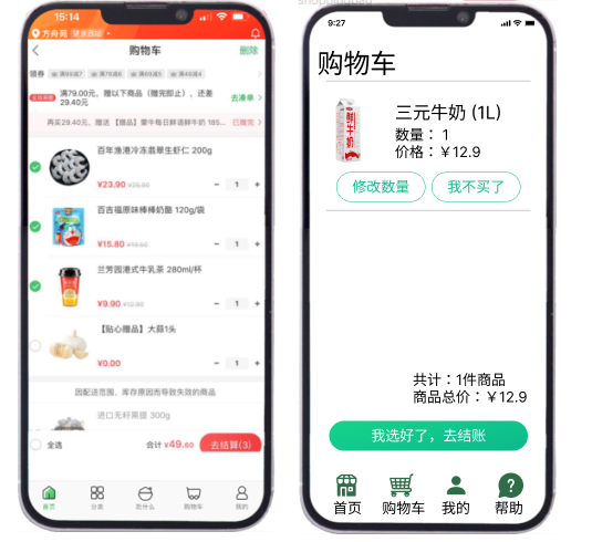
shopping cart page comparison: before & after
Testing Evidences
My aunt, 65 years old
Enlarged font size are easier to read.
Very positive towards the idea of rephrasing the menu, ie choosing “I don’t want this item” instead of “delete” which feels like more “human” instead of a cold machine.

My uncle, 65 years old
It’s more clear and easier to find what I want with simplified journey/menu and without the messy advertisements.
My aunt, 70 years old
Feels somewhat confuse because some buttons are not clickable, but it’s better than the old version.
Like the option of call for service and pay by cash on delivery.


Post-Reflections
During the testing of the prototype, there is always the figma headbar on top which prevents them to see the whole page (it varies based on specific model of smartphones they are using; I only prototyped on my iphone13), causing some issues.
wasn’t able to prototype everything given time restriction for the project, sometimes it’s confusing since not all buttons are clickable, so I did not get a complete user test experience. Another factor is, my aunt & uncle and my parents who tested my prototype actually had online shopping experience so they have the idea of how to do it in mind. I didn’t have chance to test with other senior people in my family or relatives/friends.
I have also deleted a lot of functions that I think is not necessary for senior people such as the fancy functions to purchase items in different ways to save money, but I am not sure how they really think about the idea. Therefore, I need to really get in touch with enough target users and make a prototype that really works to test what changes can be made.